Challenge
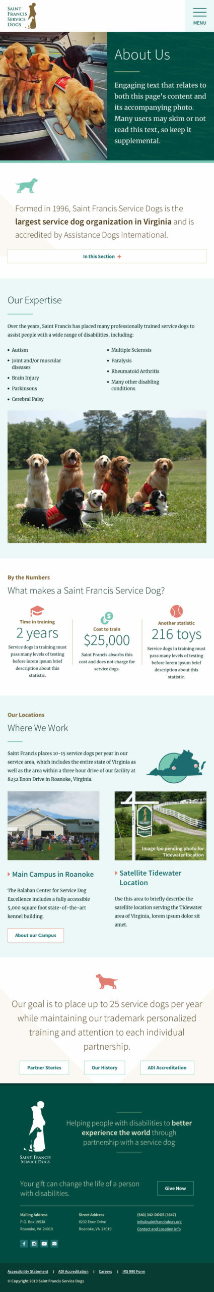
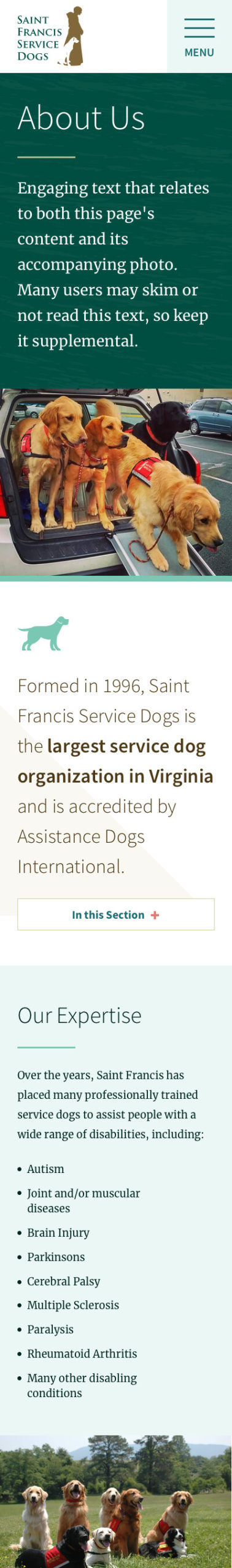
Founded in 1996, Saint Francis Service Dogs is the largest service dog organization in Virginia. Their goal is to train and place 25 service dogs annually with people who have mental and physical disabilities. Despite this audience, Saint Francis’s website was neither device-responsive nor did it meet very basic accessibility guidelines.
The old site used outdated desktop-based publishing software that was scheduled for retirement. Making updates to the site was a fragile process that had to be done on a single content contributor’s local machine.
The goal for this redesign was to create a modular design supported by a new back end to make it easier to update by more team members. The solution required an evergreen strategy that didn’t rely on professional photography resources, content restructuring, or an in-house web team.
Defining a Design Direction
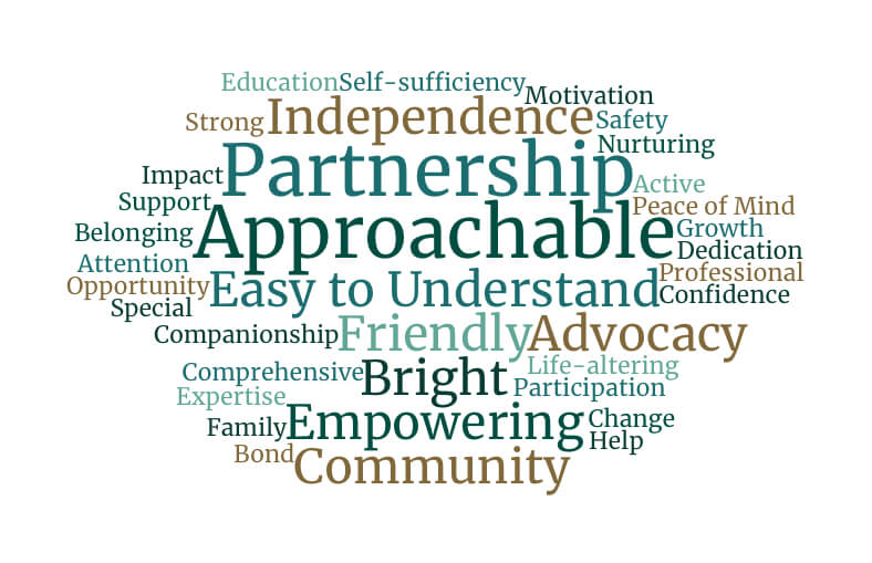
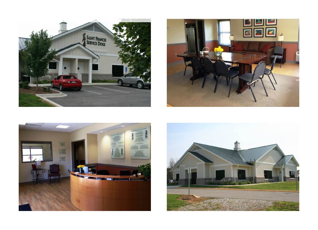
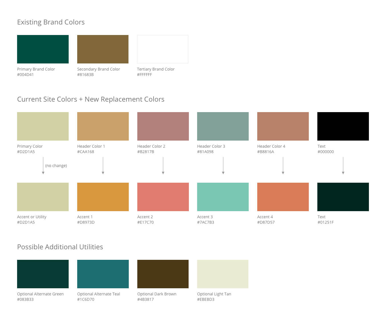
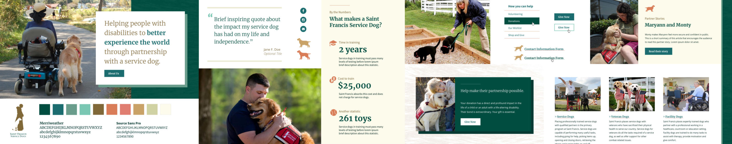
Before beginning page designs, I led the Saint Francis team in some basic design exploration by creating element collages. To create the collages, I reviewed the organization’s existing branding, including elements of their physical campus location, did a brief keyword exercise, developed an updated color palette, and selected new web fonts to best echo the typography used in their print materials.
Using these design assets, I created two collages for the Saint Francis team to review. Their choice of collage would be used to inform future design decisions for the site.
Element collages I created for Saint Francis Service Dogs. Click images to view in lightbox – use the zoom tool in the top right of the lightbox viewer to see details, or click here to download a full-resolution version.
The first collage was the most similar to Saint Francis’s existing print and promotional branding. It featured a wide color palette, bold serif headlines, and a fur texture.
Collage two had a sleeker and more minimal style. This approach used a more limited color palette and geometric graphic elements instead of the organic textures used in the first collage.
After review, the Saint Francis team chose to move forward with the second, more modern direction — while borrowing a fur texture from collage one.
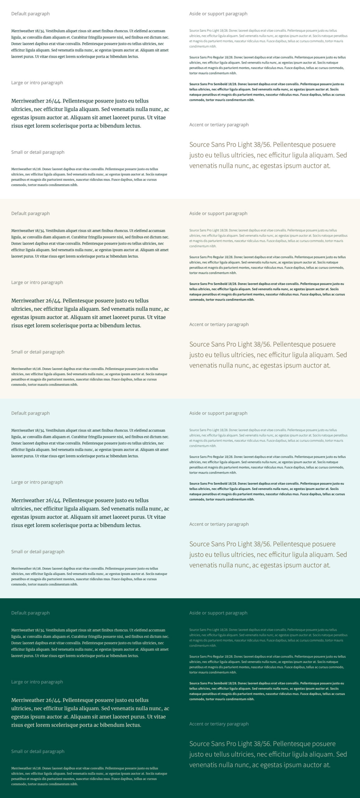
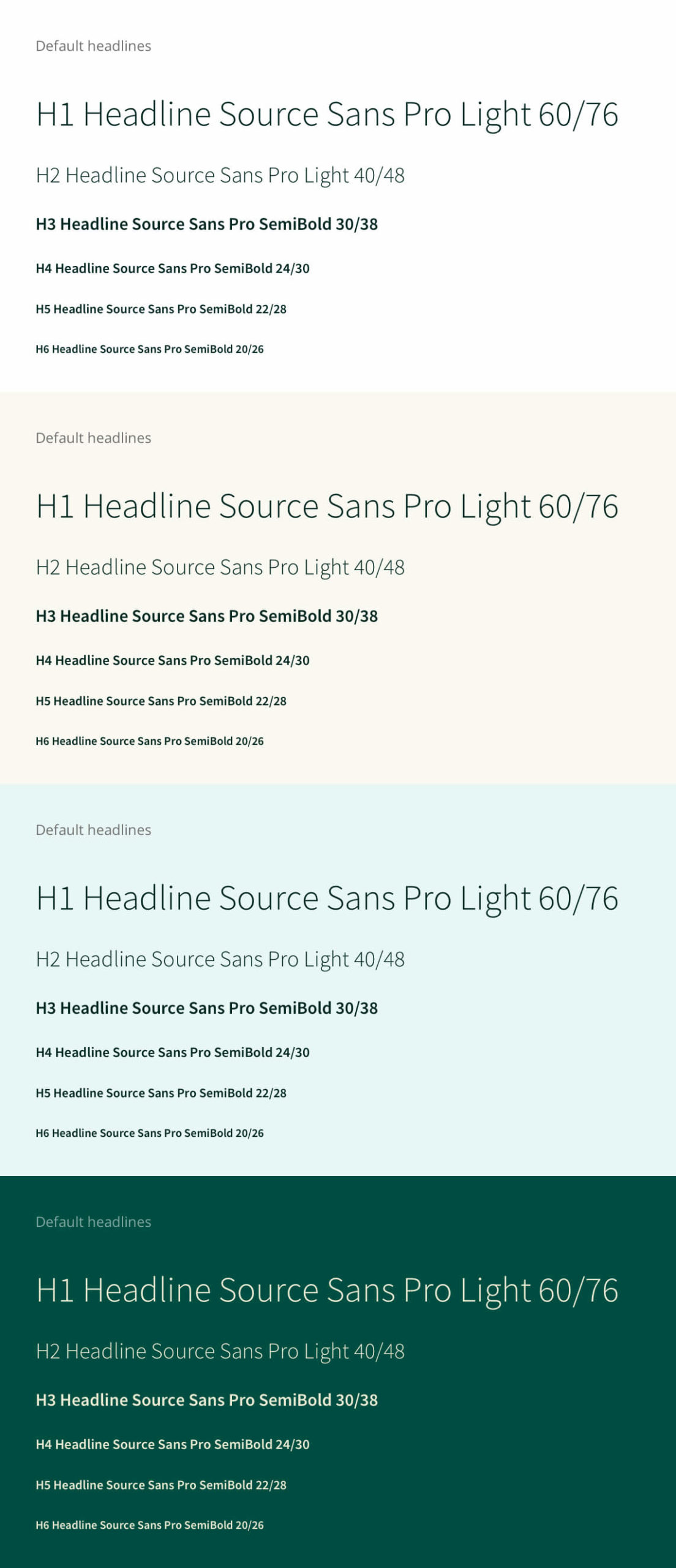
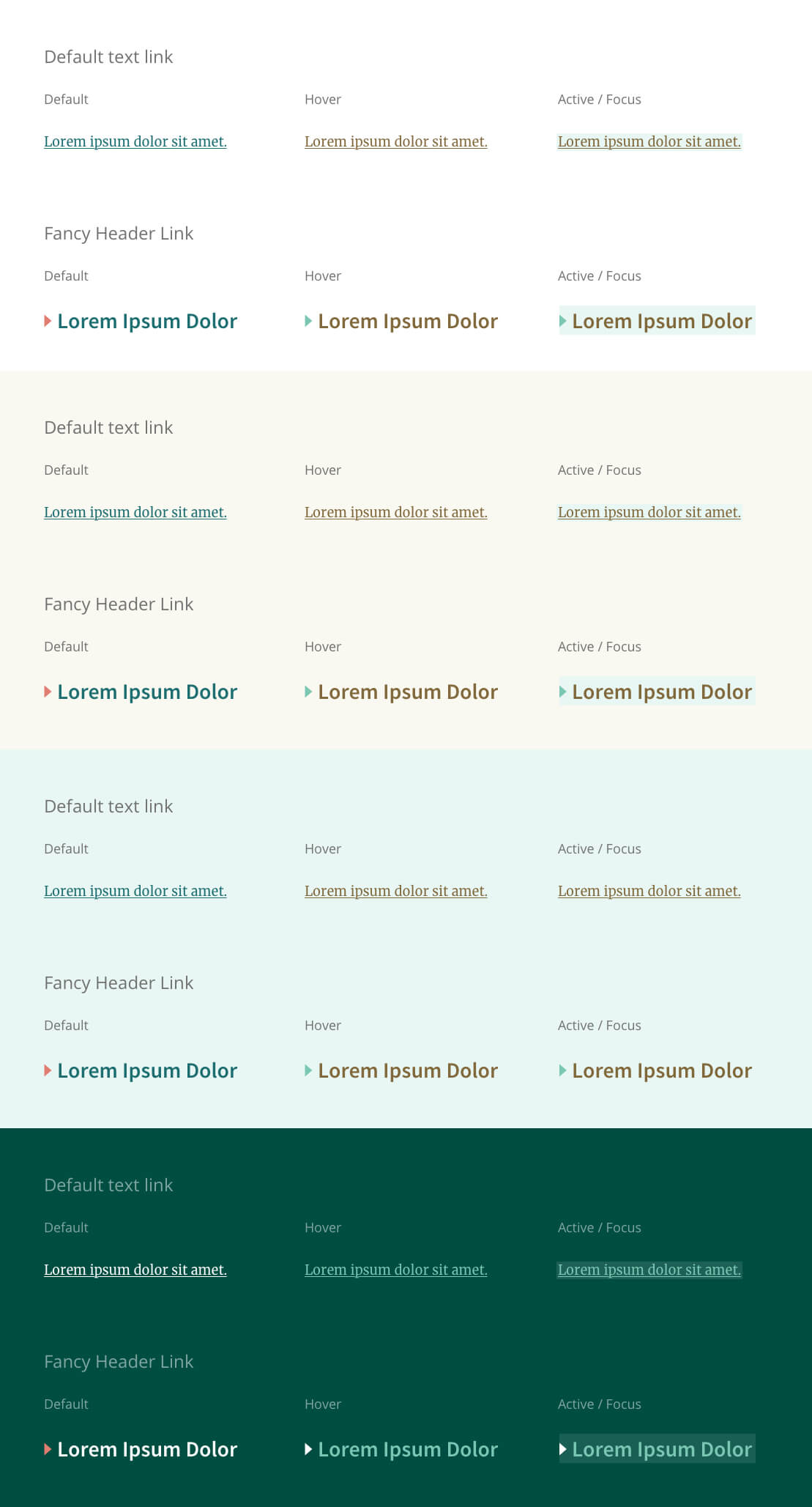
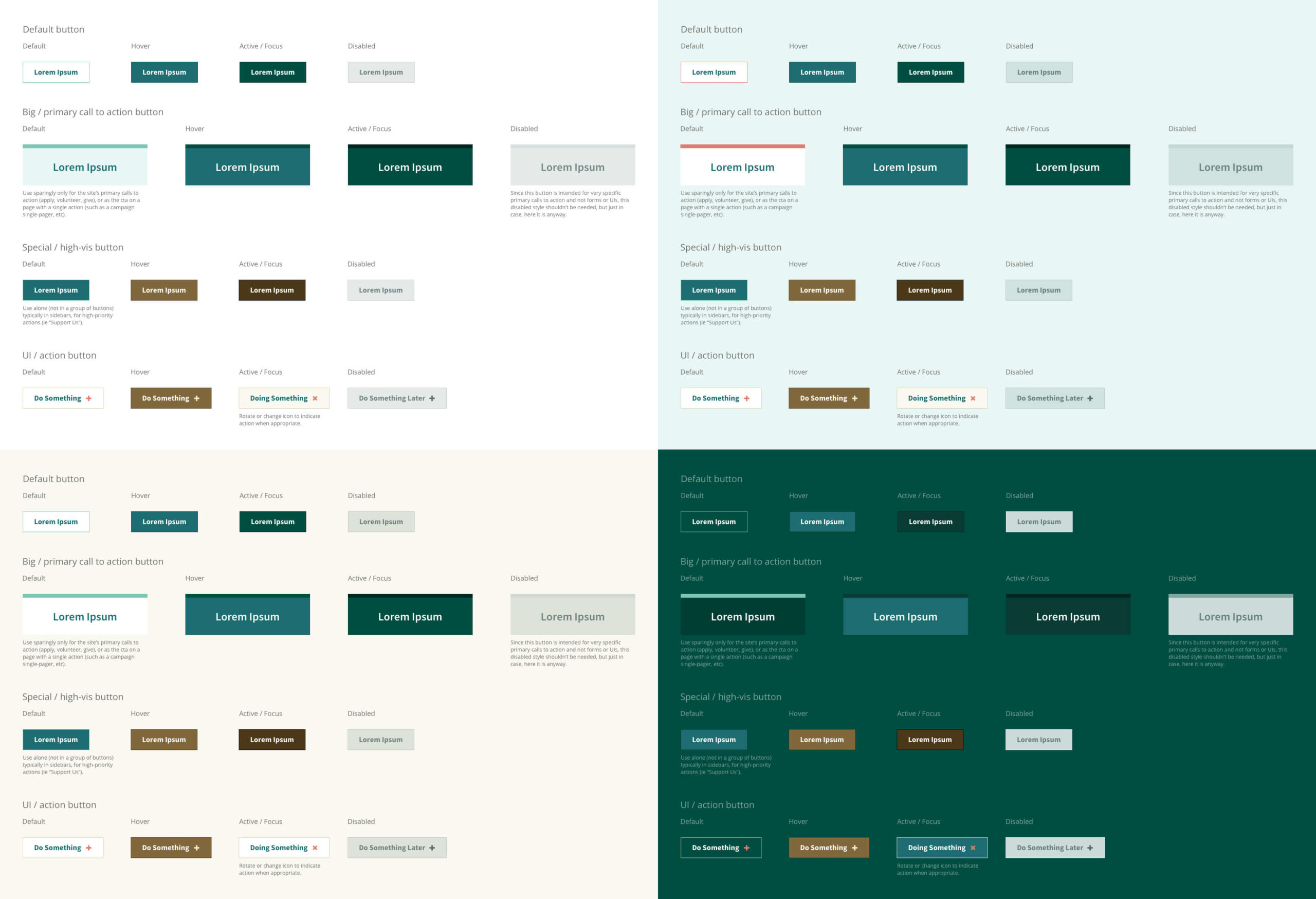
An Atomic Foundation
I started translating the team’s chosen collage into atomic design components. My goal was to create a small library of basic pieces that could be expanded in a later phase of the project. That would allow us to retire the broken current site more quickly, and give us a good working foundation to grow afterward.
Gallery: Atomic Starter Kit
Click images to embiggen — use the zoom tool in the top right of the lightbox viewer to see details, or download this zip file of full-resolution artwork.
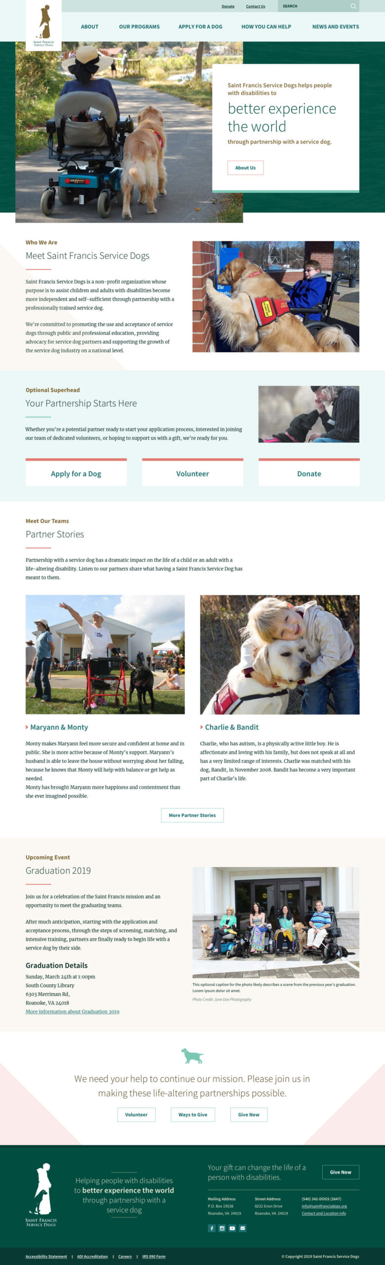
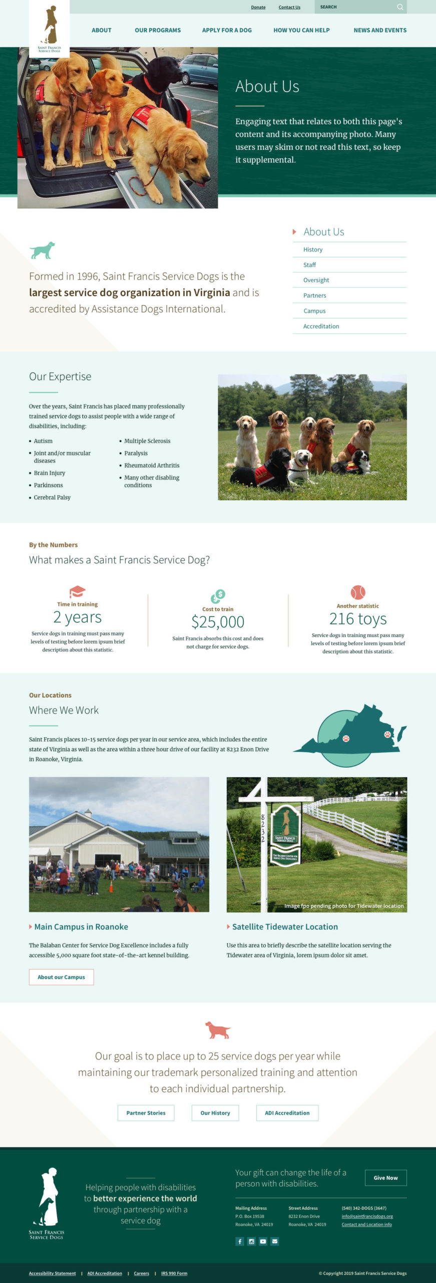
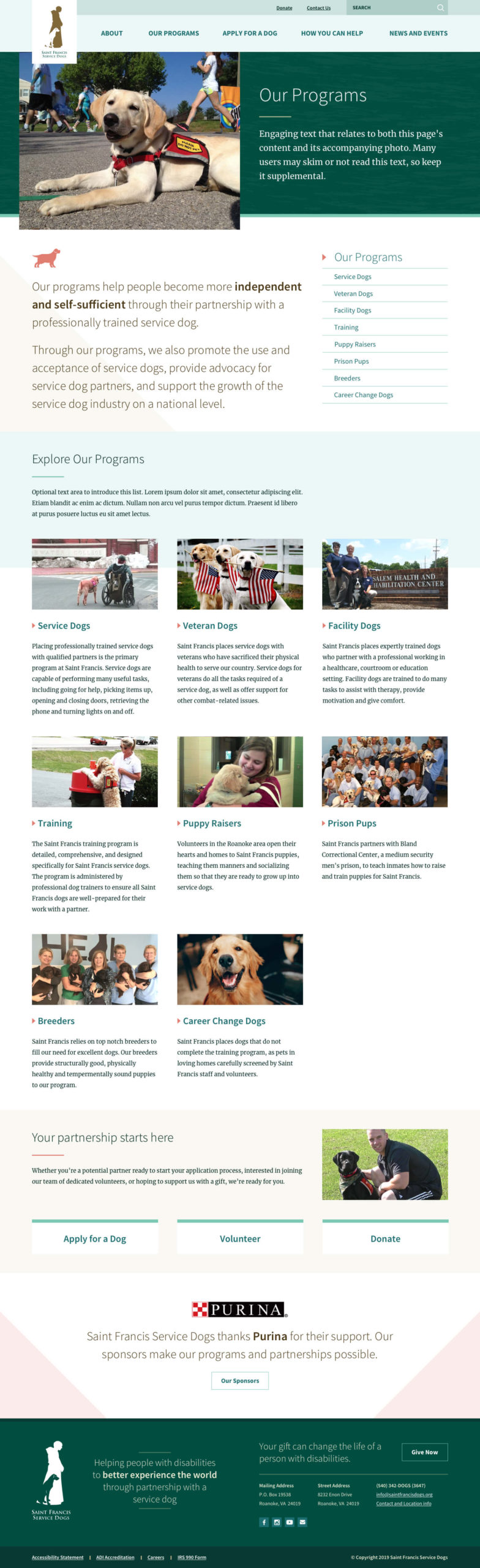
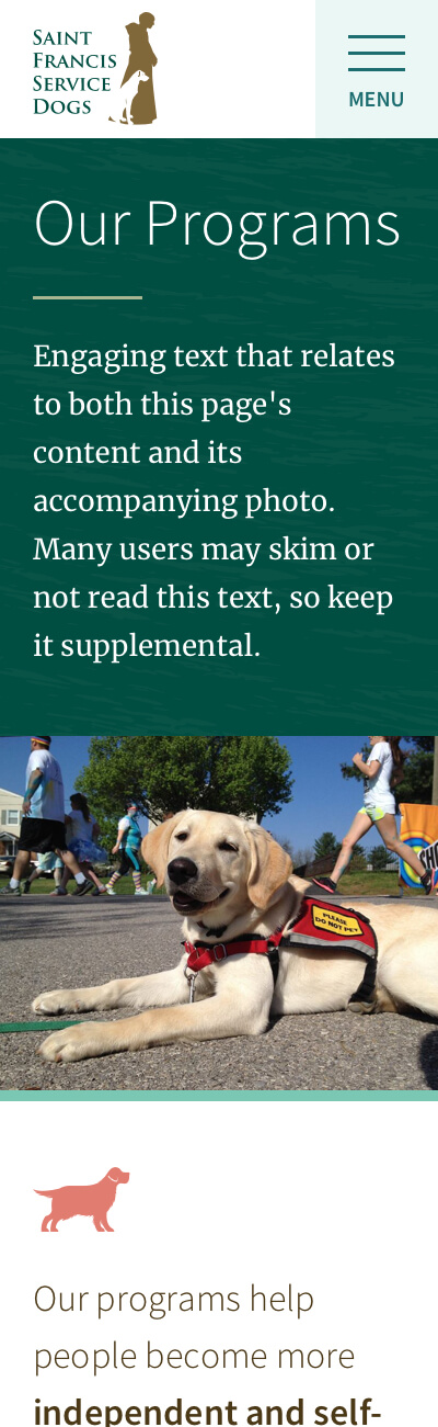
Accessibility-Focused Design
Because the site’s primary audience was people with disabilities, accessibility was a very high priority in this design process. Although WCAG 2.0 AA compliance is the goal on all sites I work on regardless of audience, I made some additional special considerations while creating these designs in order to make that compliance more likely. I opted for large text where possible, and chose simple, straightforward page hierarchy structures. There are no motion effects to disable, and no text-on-image overlays to impede readability.
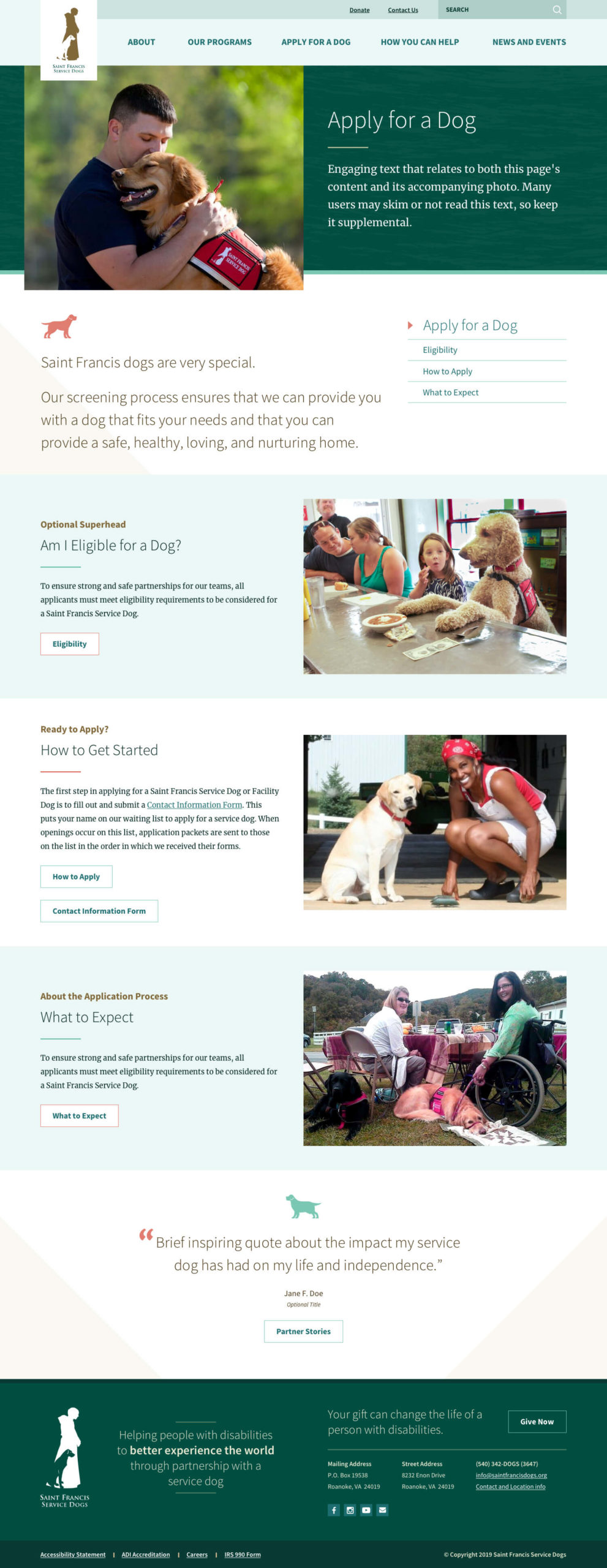
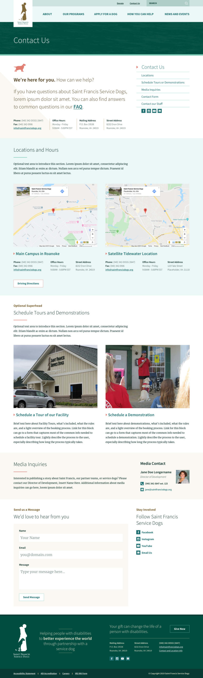
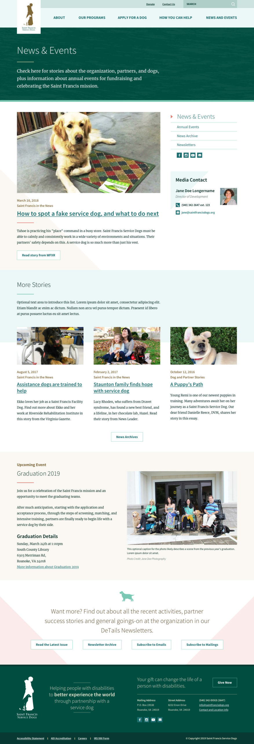
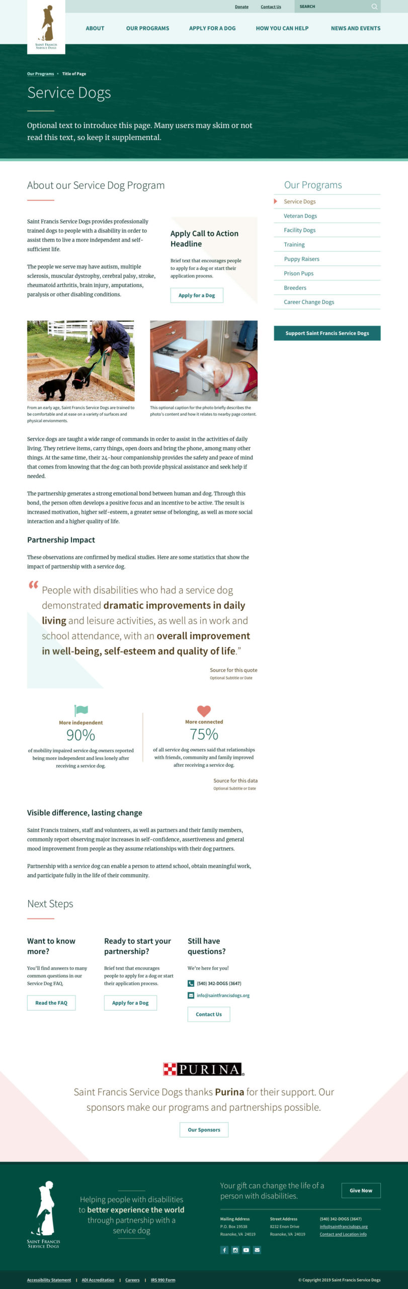
Gallery: Page Designs
Click images to view in a lightbox. To see details, use the zoom tool in the top right of the lightbox viewer or download this zip file of full-resolution artwork.
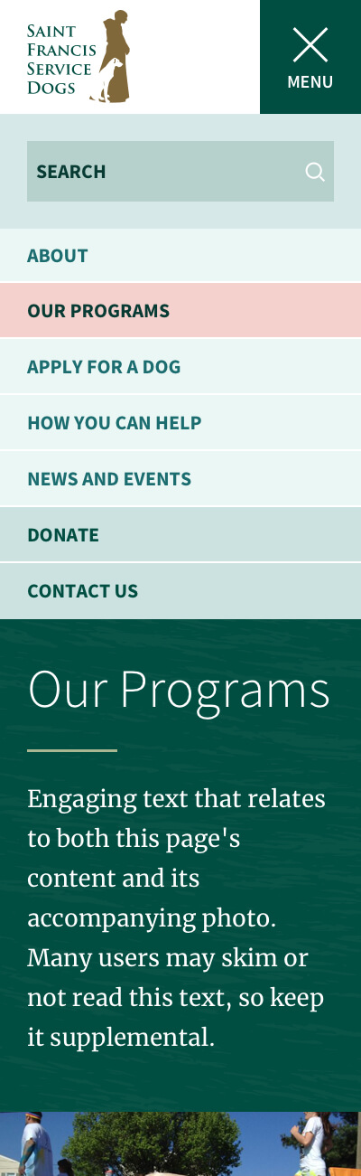
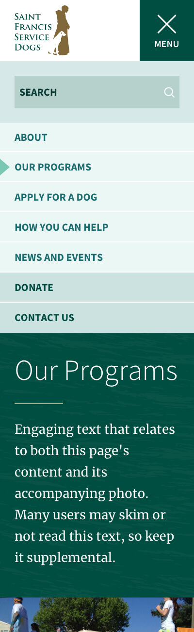
Gallery: Responsive Comps
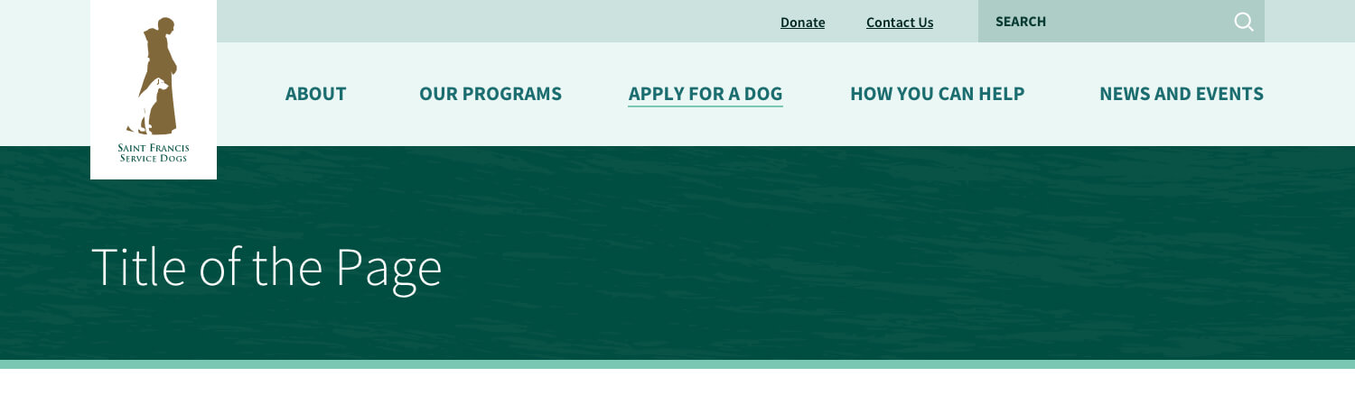
I also prioritized device adaptability for users who may be more likely to use handhelds. Obviously responsive design is a standard for any site, but in my agency work we generally do not mock up small-screen behavior beyond navigation elements.
To help ensure accessible behavior regardless of device, I created extra comps to show how the patterns would behave on tablets and phones.
Click images to view in a lightbox. To see details, use the zoom tool in the top right of the lightbox viewer or download this zip file of full-resolution artwork.
Gallery: Navigation Patterns
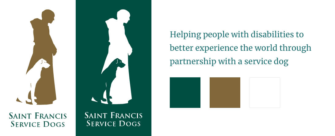
Solving a Design Problem: Working with a Tall Logo
Saint Francis Service Dogs has a very tall logo. The mark is roughly a 2:5 ratio and the text below is proportionally small and set in a small-caps typeface that’s tough to read when scaled down. It looks great on print materials, but doesn’t translate well to web mastheads. It was a challenge to find a layout that worked with the necessary global navigation without scaling down the logo too much.
After lots of experimenting, research, and phoning my designer friends, I settled on a tab-style layout. It allows the logo to scale proportionally taller than the global navigation bar while keeping the global nav at a reasonable height. Tabbed logos are tricky — they can look great on homepages or top-level landings, but flail on lower-level pages if the tab overlap area is too tall. I tested the tab on basic page layouts to find a best fit that was not too overwhelming.
On smaller screens, the tab gets in the way of usability, so we switch to a secondary mark that has a closer-to-square ratio.
Header Logo Solution Gallery
Navigate through the carousel to see the problem and solution. Click images to open in a lightbox.
Translating Existing Content to Designs
Saint Francis Service Dogs had already developed a lot of content while creating their older site. One of the goals of the new site was to refresh and modernize without having to write new content to fit the designs.
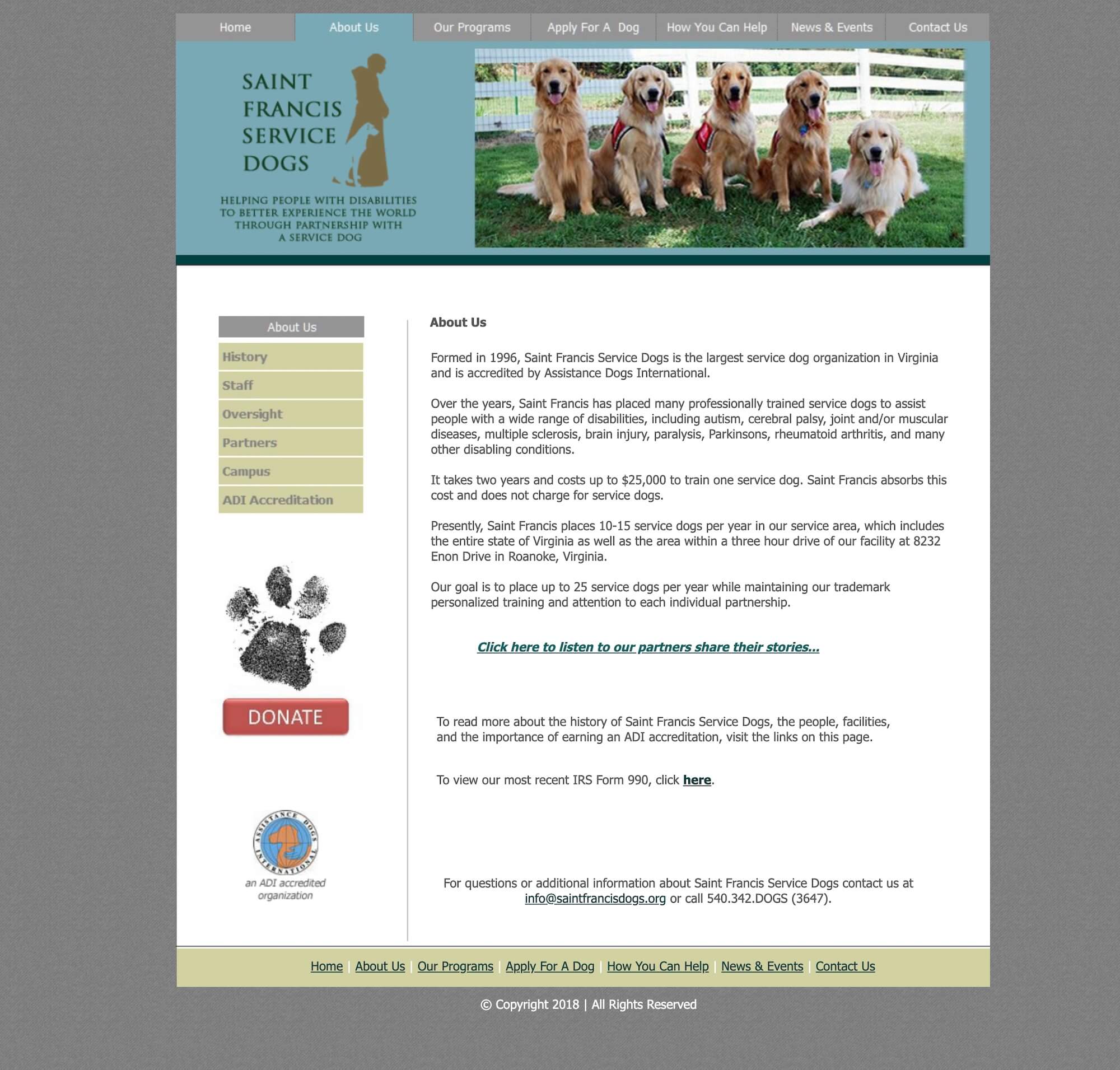
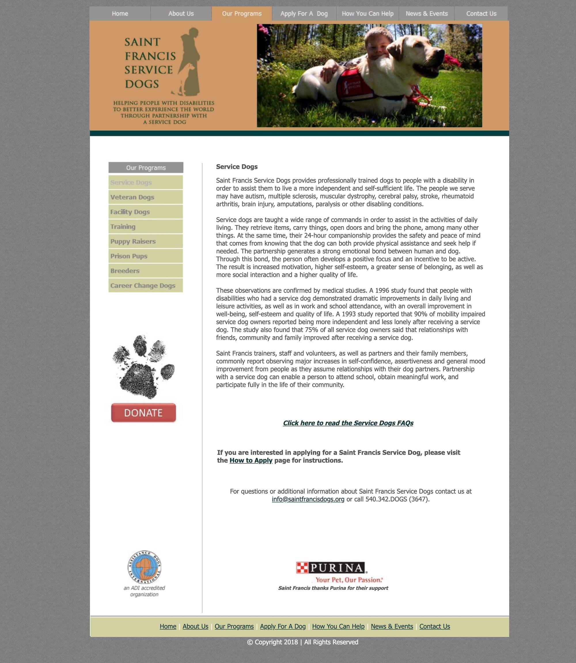
These before and after comparisons show how I reworked their existing content to fit the new patterns — same story, same message, new containers.
Before & after gallery: click images to view in a lightbox.
Development: Prototype to MVP
During the design process, I also built a front end pattern library in Pattern Lab, and a prototype back end in WordPress. Both were created to test ideas during the design phase, and to demonstrate the future site’s functionality and editing capabilities — specifically how updating WordPress would be different from the locally hosted desktop program they were currently using.
The intent was to get the WordPress prototype to a minimum viable state so that the aging broken site could be retired, then build out more functionality in the future.
Before completion of the project, the client’s goals changed and an agency was hired to build a different site.