Challenge
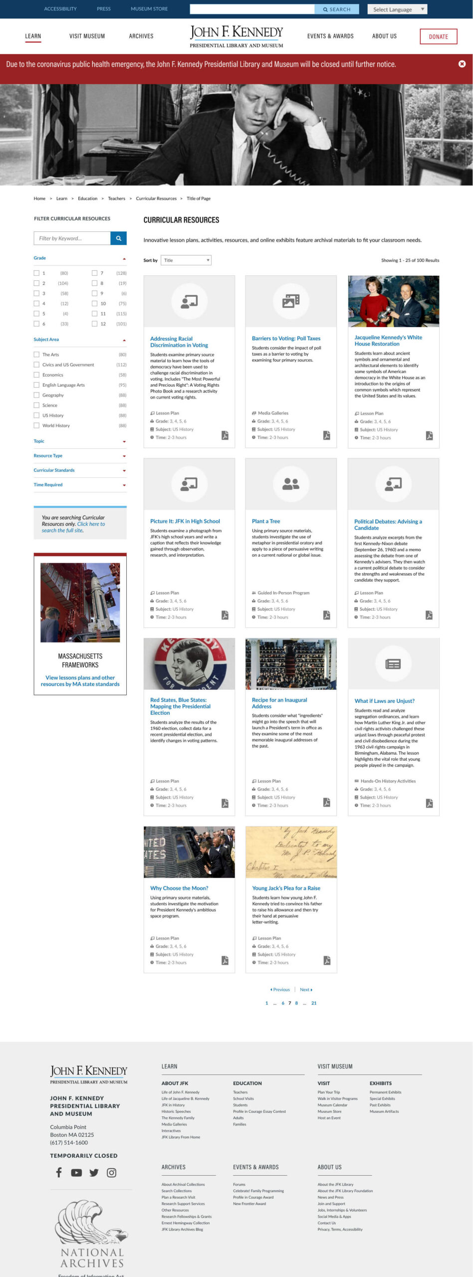
The JFK Library’s Education section has a large collection of curricular resources for teachers. These include lesson plans, guides, and other classroom tools teachers can use during instruction.
This collection lacked any structure to make it searchable or filterable. Teachers hoping to find resources had to sift through long index pages that were manually created by the JFK Library content team.
My Chromatic team and I helped the library create structured facets for these resources, and a shiny new search interface specifically for curricular content. As a result, educators can find exactly what they need to enrich their coursework.
Needles in a Haystack
Since the curricular resources lacked structured content or a means of search, the library’s content editors had manually created index pages to organize them. When new resources were created, they had to be manually added to the indexes. Teachers hoping to find curricular resources had to comb through these pages, sifting for content applicable to their needs. There were tons of valuable resources, but finding the right one was difficult.
Each resource’s detail page supported only an unstructured rich text field. Editors did their best to create “facets” within this unstructured content, but again, it couldn’t be used for filtering or searching.
Ready to Improve
After some time using this cumbersome, makeshift solution, the JFK Library team had a clear idea of how they wanted to solve the problem. When we began the project, they had already determined new content types for the curricular resources, and performed peer research of other sites with good faceted search tools.
The library team had identified elements of search interfaces from PBS and the Library of Congress they wanted to emulate. During the design process, I reviewed these peer sites and evaluated our ability to deliver similar functionality within the library’s existing design language and Drupal configuration.
Before: manually curated index of resources, and an unstructured detail page. Click images to open in lightbox. To see details without compression, download a zip of full-resolution images for this project.
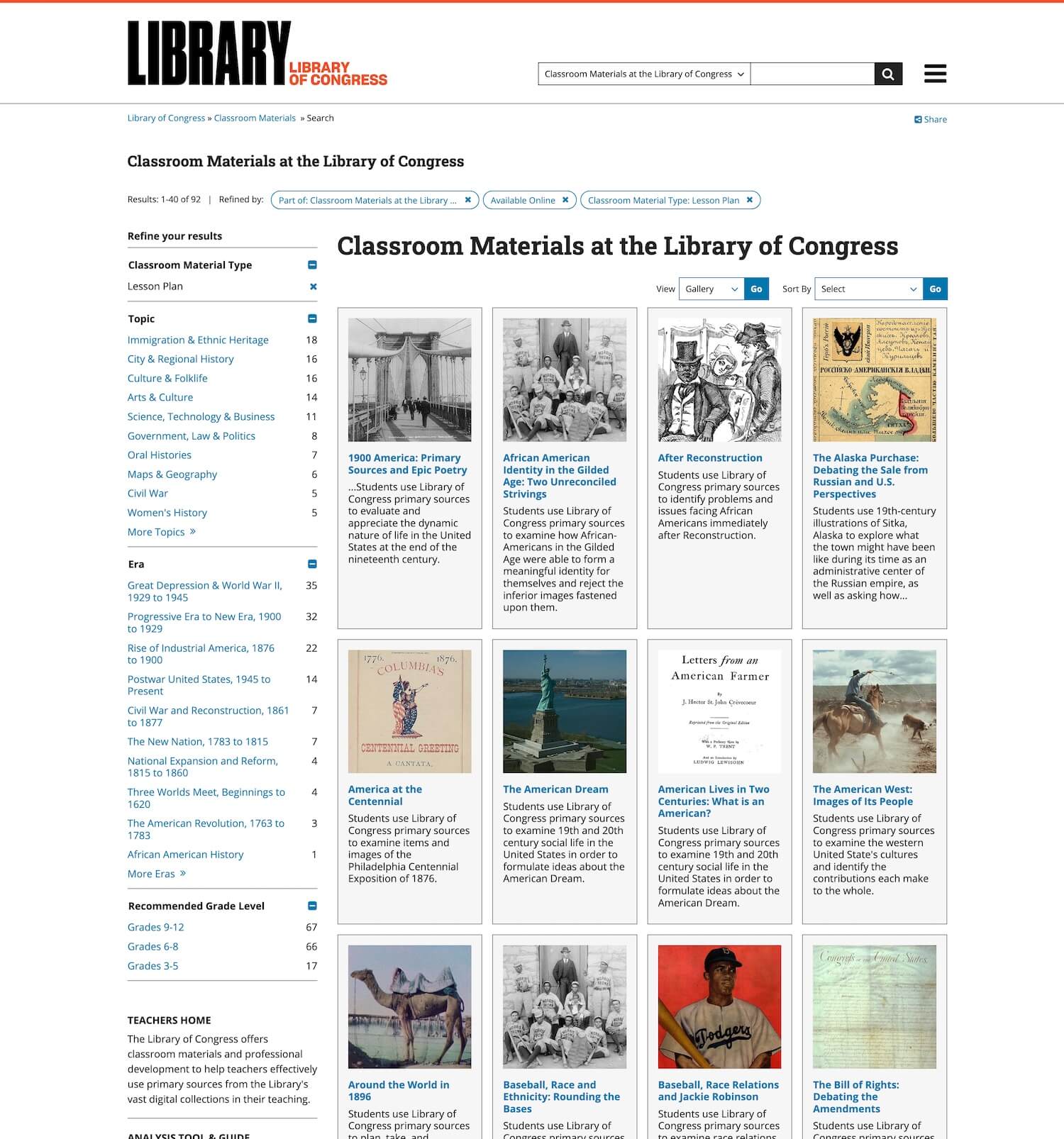
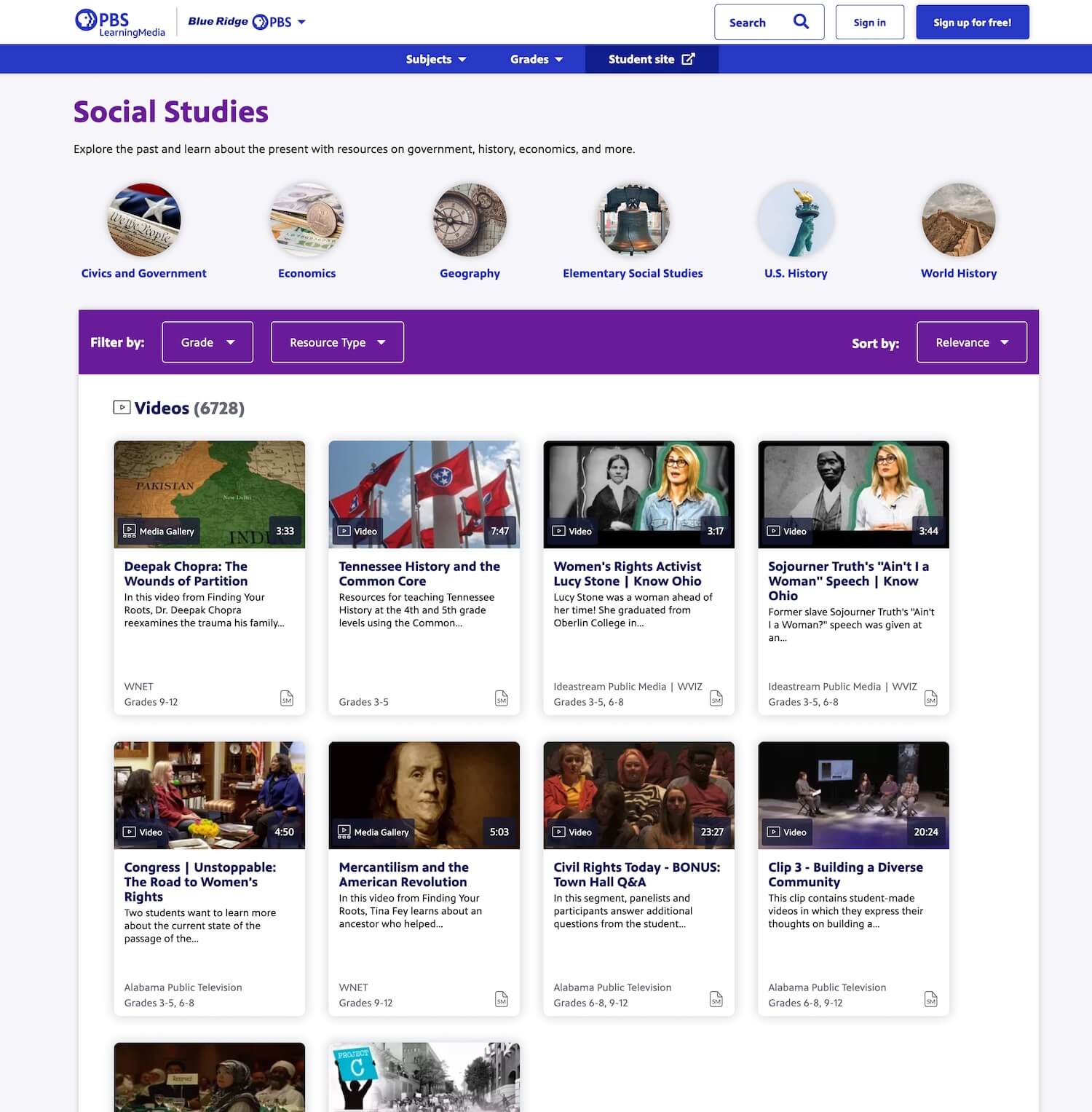
Peer sites that informed our design process. These sites, which also provide classroom materials, organize using faceted search, grouping of results, and a card-style view for resources in results.
Interface Design Process
Using Figma, I created prototype designs for elements to support faceted curricular resources. I designed search and filter components, results views, and a detail view for the resources.
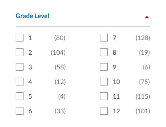
Faceted Filters Interface
The library’s main site search had a faceted search interface, but we wanted a slightly different experience for curricular resources. I designed the new filters to be collapsible and easy to scan.
Goals for Facet Filters
- Filter interface can support long lists of facet categories and child options
- Filter lists can be expanded or collapsed
- Users can easily see what filters are applied
- Filters are easy to find and apply on any size screen
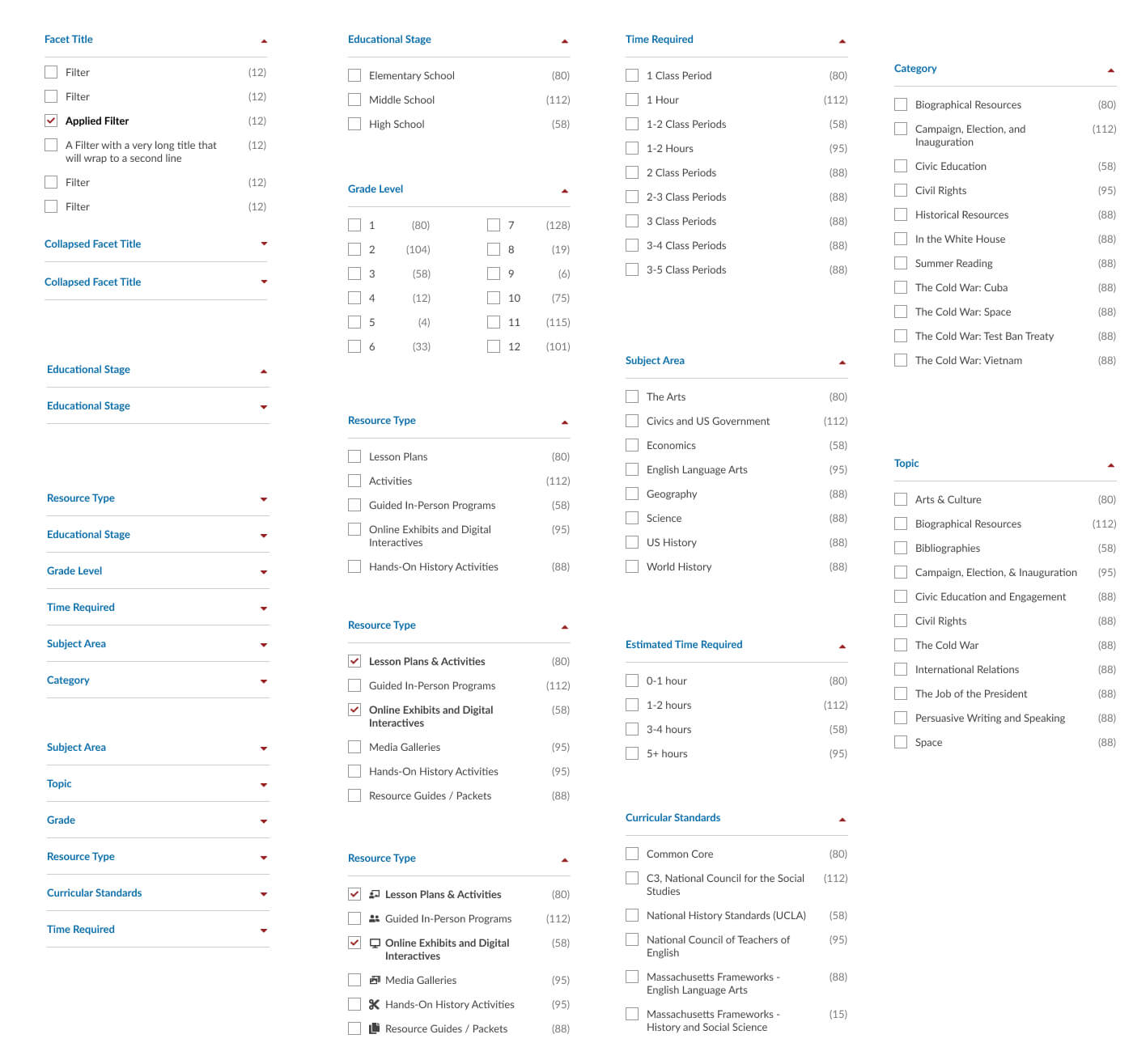
Examples of faceted filter variations needed by the library’s curricular resources. Selected filters have bold labels and a checked checkbox. The number to the right indicates how many results of that type are available. Click image to enlarge in lightbox.
List Toggling
Since there are a lot of categories and the lists are long, the facets load with all but the first two categories in a collapsed state. These two lists comprise the most commonly used filters (Grade Level and Subject Area). Lists can be toggled by clicking anywhere in the list header.
A red triangle arrow also indicates open/closed status. When toggled, the triangle animates a rotation and the list slides open/closed.
Two Column List Layout
The Grade Level list utilizes a two-column view option to optimize vertical real estate, especially on small screens. Since the Grade Level labels are so short, we can save mobile users a little scroll-effort.
This makes for extremely narrow columns — I wouldn’t recommend this layout for labels of unknown length. Were this part of a design system, providing this two-column filter layout could be risky. At a minimum, such a component would require good usage guidelines.
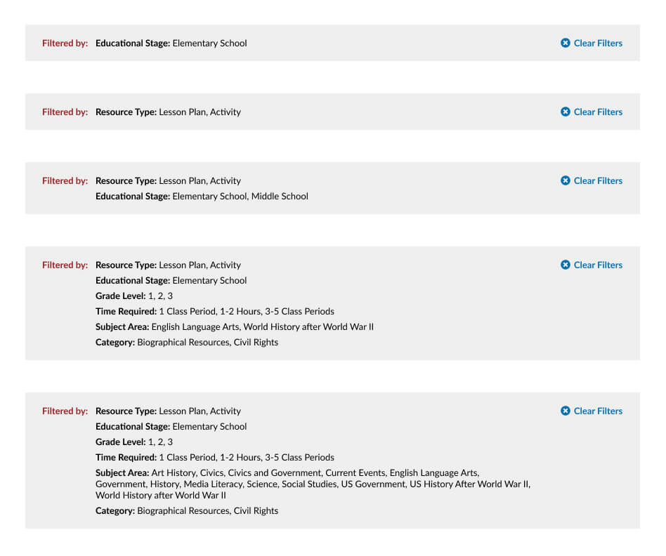
Viewing Results
Once the filters are applied, we have to let the user know what their results are, and what filters they’ve chosen. A selected filter in the facet list has a bold label and a checked box, but we also provide a summary of filters above the results. This summary gives the user an easy-to-scan rundown of their selections and a quick button to clear them all.
Results summary examples: in context (left) and possible content variants (right). When filters are applied, they are listed in this summary above the results. Click to enlarge in a lightbox.
Results as Cards
The results themselves are rendered as cards. Each card displays the resource’s new taxonomy information so they can be easily browsed by educators.
We opted for a grid of height-matched rows over a masonry grid to make the results easier to scan and compare. I usually discourage masonry grids for results that need to convey anything beyond images or very simple, easy to parse content. It would be a shame to build and populate all these new content types, only to have them lost in a jumbled grid of results!
Example of results formatted as cards. Facet data is displayed at the bottom of each card for easy comparision across resources. If a resource has no image associated, the card displays a stylized photo of the library.
Grouping Option
To offer users even more fine-tuned control of results, we created a “Group by” option that organizes the filtered results into groups. This emulates a similar functionality seen on the PBS site.
I designed a “Group by” view with headings for each facet option, with links to view all the resources in that category. This allows educators to see highlights of what’s available within a certain category.
For the scope of the project, we only built the ability to group the results by one facet (Resource Type). Ideally, the library has the option to expand this to allow result grouping by any facet.
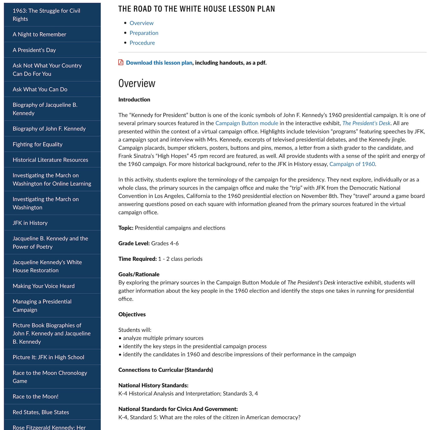
Detail Views
Armed with structured content types, we were able to create better detail views for the resources as well. The updated resource detail lists the facets of a resource in a list format with icons for easy review. This allowed the library’s content team to remove this metadata from the resource content.
Before and After: Resource detail view.
Illustration Challenge
I’m not an illustrator or iconographer, but I always appreciate the challenge of expressing a concept through icons. Most of the icons needed to convey ideas in the JFK Library project were common enough to be found in any icon library (for this project, we used Font Awesome).
In order to group results by grade level, we needed an icon to represent elementary, middle, and high schools. I didn’t want to use a school building or student icon for all three. These three options would be the only groups in the view, so the icons needed to be distinct from each other depending on grade level. I made this grade level icon set to illustrate each group.
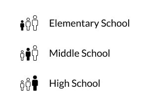
Development Process
Concurrent with my design iterations, my Chromatic colleague Märt Matsoo configured the library’s existing Drupal back end to allow for the curricular resources’ new field types. Once Drupal was rendering a search interface, I added new front end styles to reflect our designs.
Despite having built front end libraries for Drupal integration for many years, this project was one of the first times I’d had the opportunity to actually modify and configure within Drupal. Through this process of collaborating with Märt to create the search interface, I gained a much better understanding of Drupal and how it approaches content management.
Working with Available Infrastructure
To create the library’s search interface, Märt leveraged Drupal’s Faceted Search module. We worked together to find good solutions for the library’s users, while remaining within the capabilities of this module and the rest of the library’s existing back end ecosystem. Collaboratively with the client, we adjusted our interface to lean on the module and Drupal’s defaults without generating a lot of custom code for the library team to maintain.
Solving these kinds of problems is one of the things I like best about a design technologist role. What things are easy to build or change? How can we make good design and interface choices for our system’s users within those bounds? Given what’s technically possible (and reasonable), what is the best answer?