Dang! This is a long one. Skip to:
Challenge
The SOM’s new site needed a visual design that incorporated both the university’s new brand and the school’s own personality.
The school encompasses many independently managed departments and lab sites, which needed to be brought under a single visual style, front end library, and management system.
To help the SOM wrangle their many sub-departments, I created a flexible front end pattern library and accompanying usage/style guide. Using their library, the SOM’s content editors are able to create pages that meet their diverse needs while staying within the constraints of the brand.
Building on an Existing Foundation
SOM already had a strong design foundation, since Emory University had just gone through a major rebrand.
SOM would be one of the first sites to launch under the new brand standards, so in addition to launching a new site, we were introducing that branding to the university community. We didn’t want to reinvent that branding, but we did need to interpret it for SOM specifically.
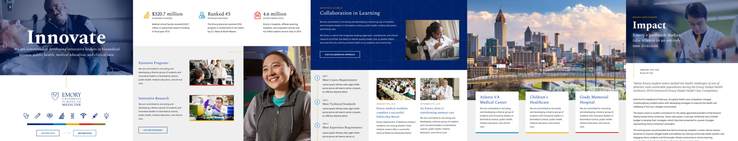
To help inform the design direction, we asked SOM to choose between three element collages. Lead designer Sara Andrew made two options, and I made a third.
Collage I created for the Emory School of Medicine. For a better look, click to open the image in a lightbox and use the zoom tool in the top right. To see without compression, download a zip of full-resolution images for this project.
Visual Design
The SOM team chose a hybrid of mine and one of Sara’s collages to continue the design direction. As art director, Sara created a set of primary design comps based on the two collages.
Although my primary role on the project was front end developer, I was able to contribute to the visual design of some of the interior pages. Following Sara’s existing direction, I designed a set of comps for departments, labs, and some other tertiary pages.
Flexible Content Block System for Tertiary Pages
Text-heavy tertiary pages needed a good system to break up content and make it easier to scan. Since many labs and departments lacked photography resources, they also needed a way to inject more color and interest into the page.
I designed a flexible modular block for SOM’s tertiary pages. Designed to compliment existing top-level page components that were more visually complex, this block’s simple-seeming options can be mixed and matched according to the editor’s needs.
To demo the concept to the SOM team, I made an example comp showing some useful combinations of the block’s options. While large, it only shows a fraction of what can be created with this simple set.
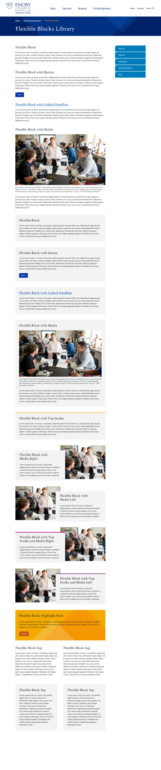
Flexible blocks example. Click the image to open the whole collection in a lightbox — it’s long!
Flexible Blocks in Action
To help the SOM team demonstrate the modular features of the design to their stakeholders, I made variants of each design using flexible blocks.
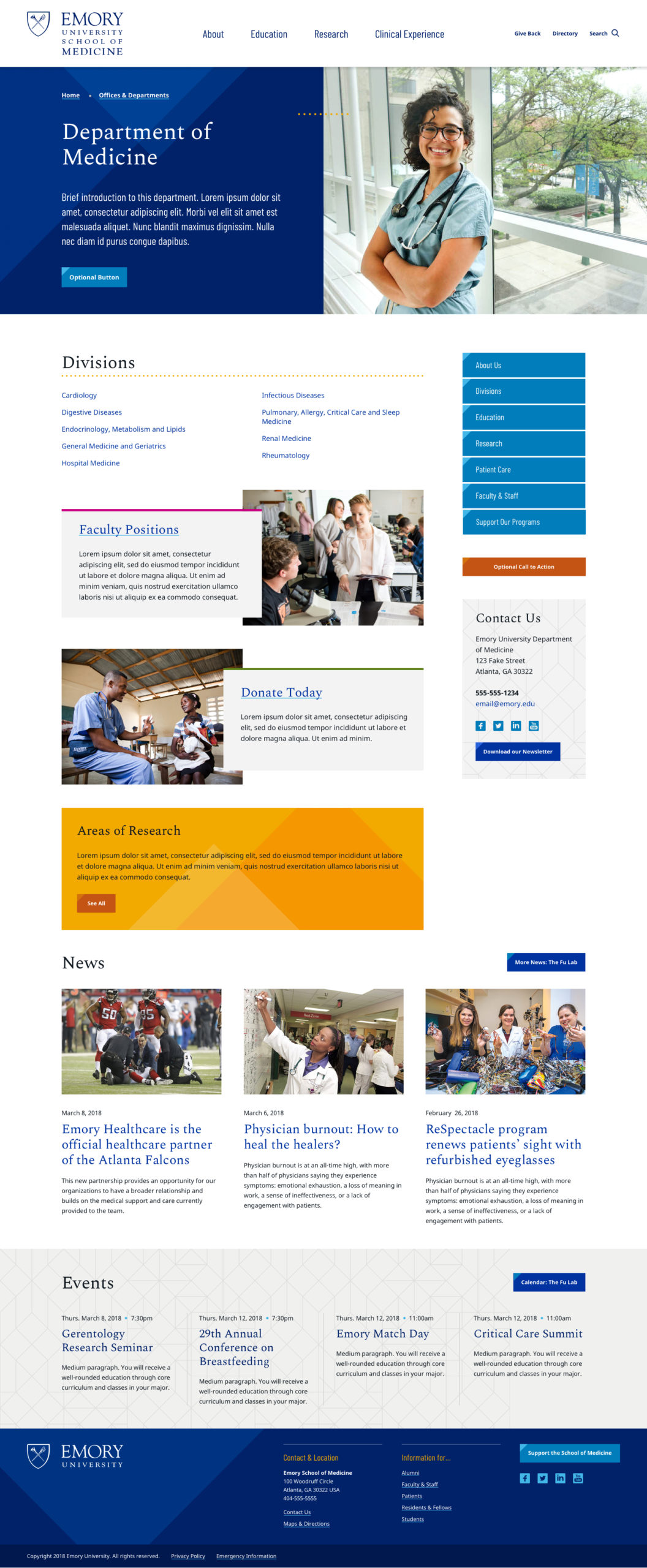
Department Page Variations
These variations show how the flexible blocks can be used to create different layouts within the same template, allowing SOM’s many departments the freedom to build homepages that support their needs.
Click pages to view in lightbox. Use the zoom tool in the top right to see more detail, or download a zip of full-resolution images.
Art direction by Sara Andrew.
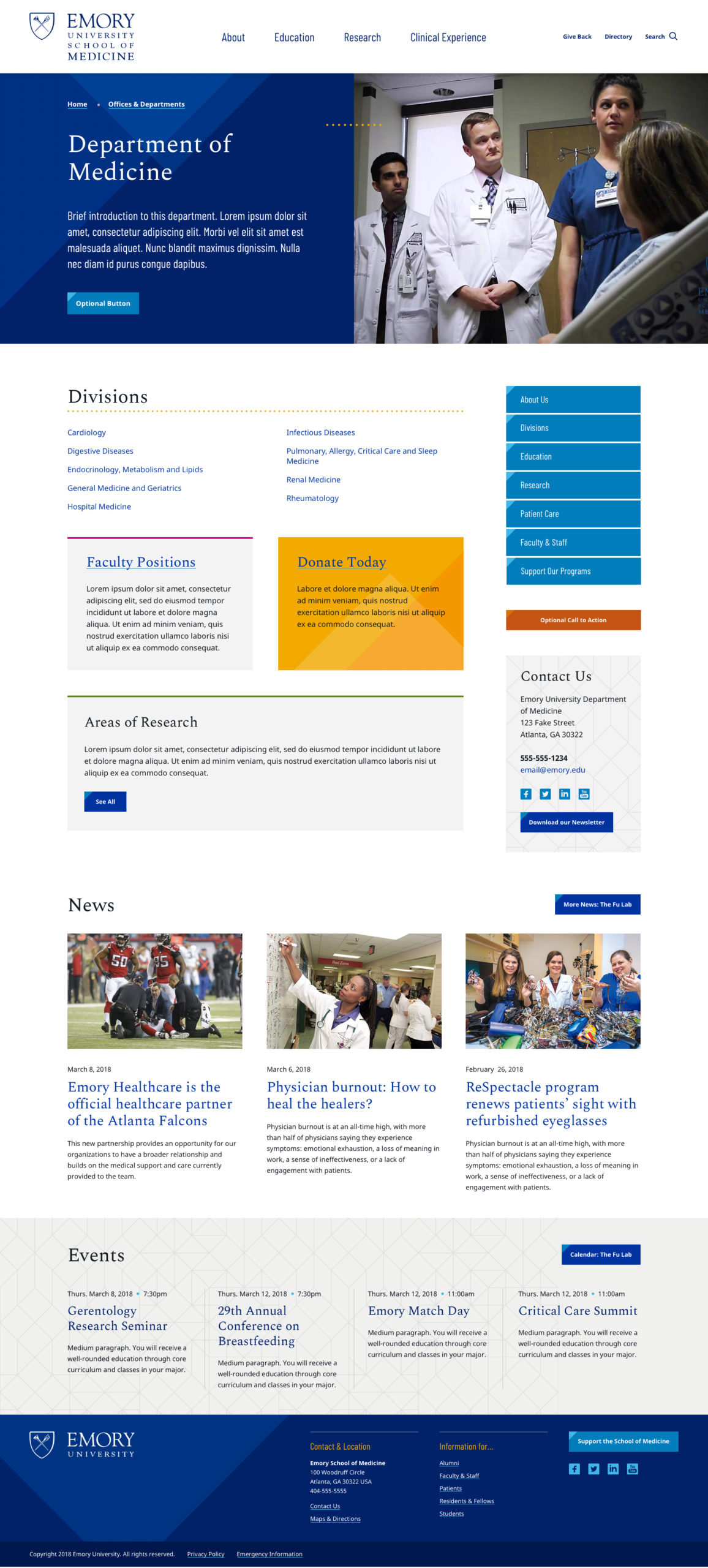
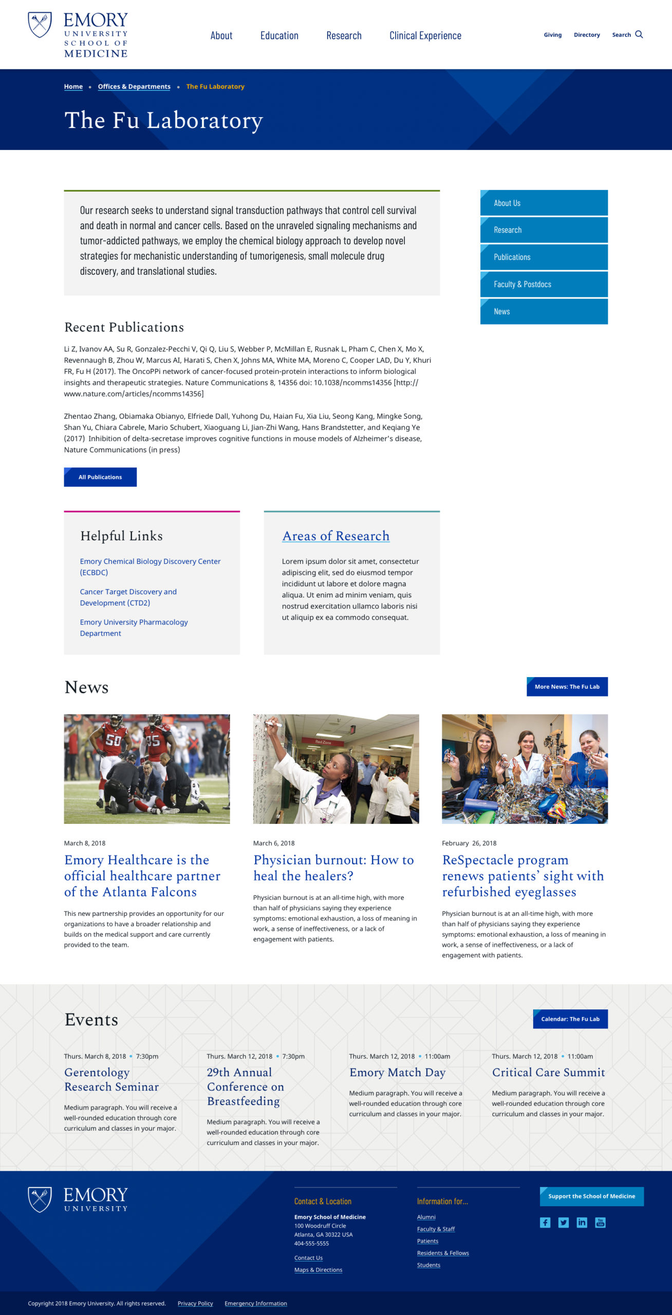
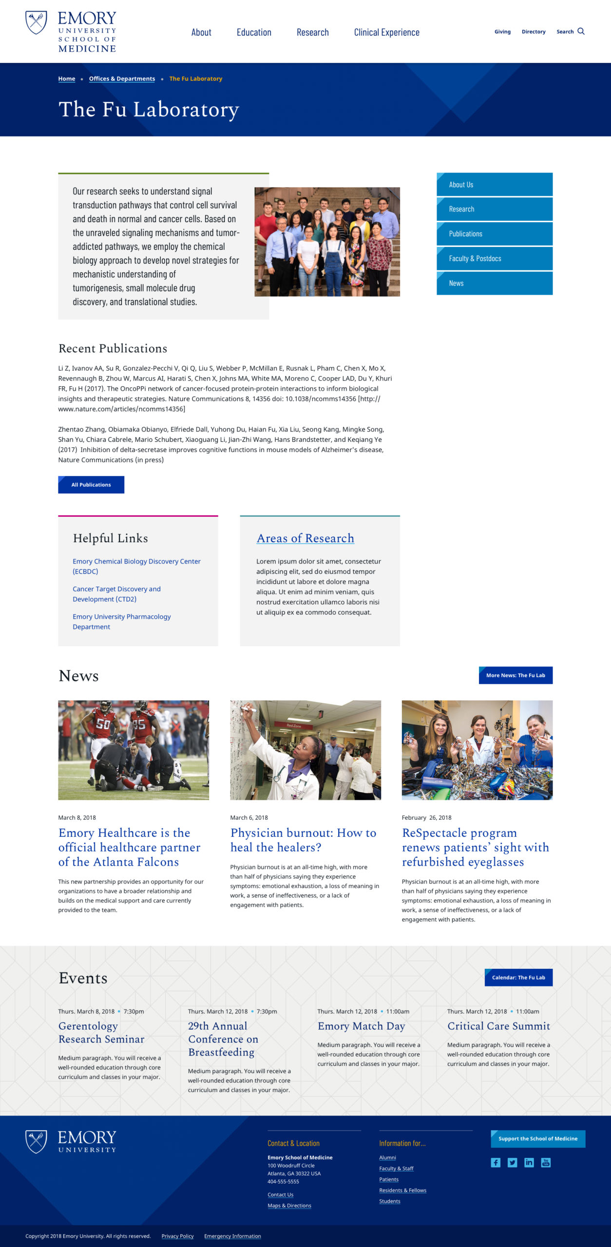
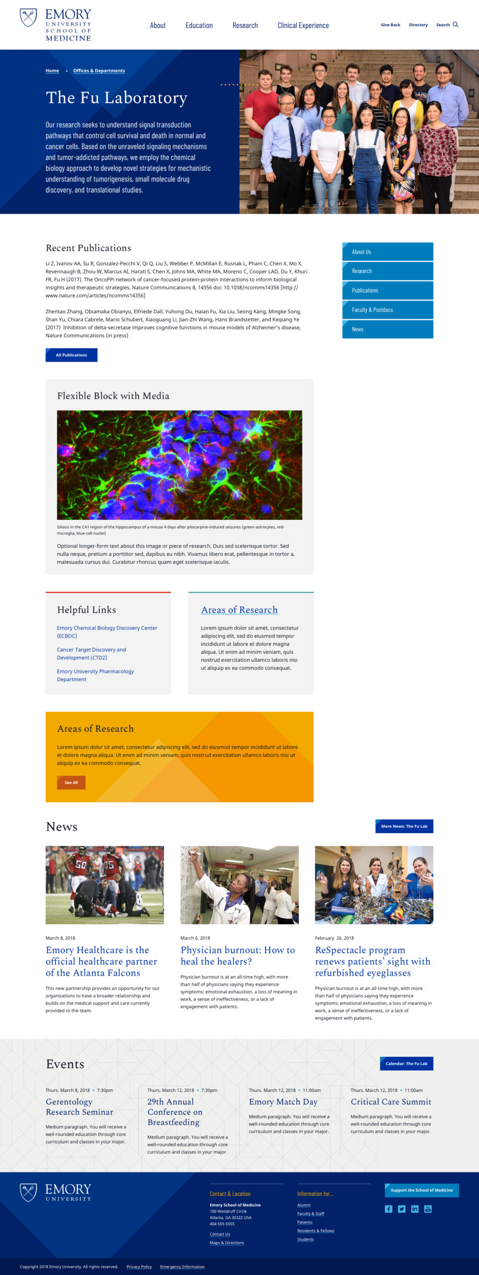
Lab Page Variations
SOM’s labs had diverse needs — some were large, with many announcements and photos. Smaller labs needed a simpler layout that didn’t depend on photography.
This set of comps below shows lab examples from simple to complex. Nearly all the content on these pages is contained in instances of the flexible block.
Click pages to view in lightbox. Use the zoom tool in the top right to see more detail, or download a zip of full-resolution images.
Art direction by Sara Andrew.
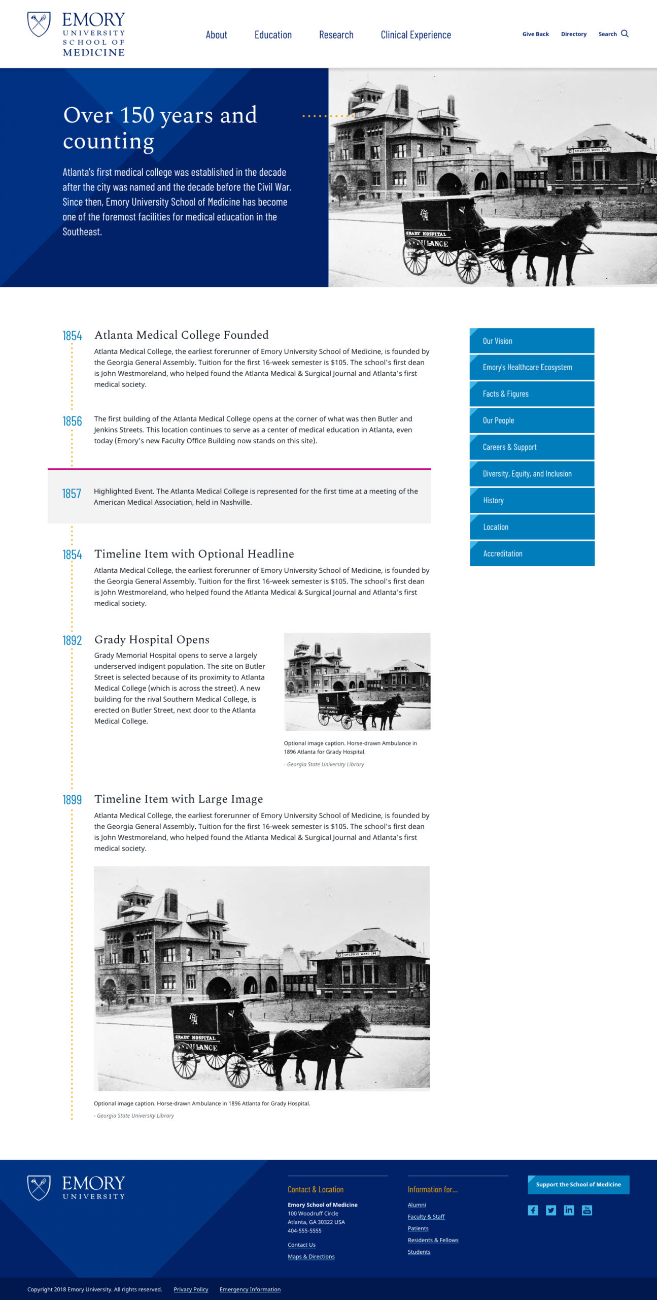
Additional Designs
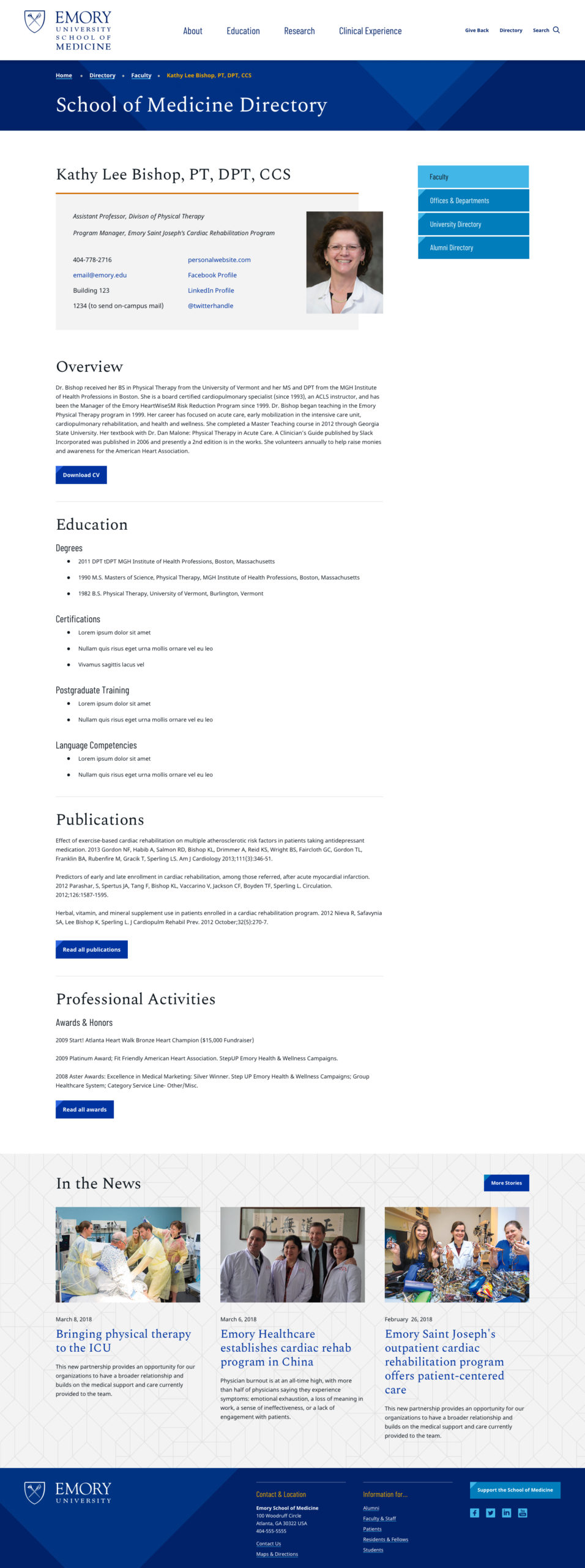
I made two other small page designs for SOM — a history timeline and a person profile.
The history design contains a set of flexible blocks connected by dots to form a timeline. The blocks have a small set of options to showcase historical images and highlight important events.
The profile design features a card to provide quick information about a person.
Design + Development
Although my contributions to SOM’s visual design were small, it was incredibly valuable to be able to participate in the process. When I began the front end development, I had much more insight into the project and its needs than I would have had I not been involved in the design stage.
Following Sara’s direction and critique was a great learning experience. It was the first opportunity I had to collaborate with an experienced senior designer on a project — a valuable, educational experience that I continue to draw from.
Better Ways to Collaborate
When Sara and I began collaborating on designs, NewCity didn’t have a reliable method for designers to work together — we passed Sketch files back and forth through Slack.
To streamline our process and make it easier for her to review my work, I set up a project with Abstract to get our designs into version control. It made the process easy for us and led to NewCity adopting Abstract as a documentation method and source of truth for team members.
Pattern Library Production
For a large site with many content contributors like SOM, an atomic design pattern library is a good front end strategy. Before I began coding, I audited the designs to identify what the patterns would be.
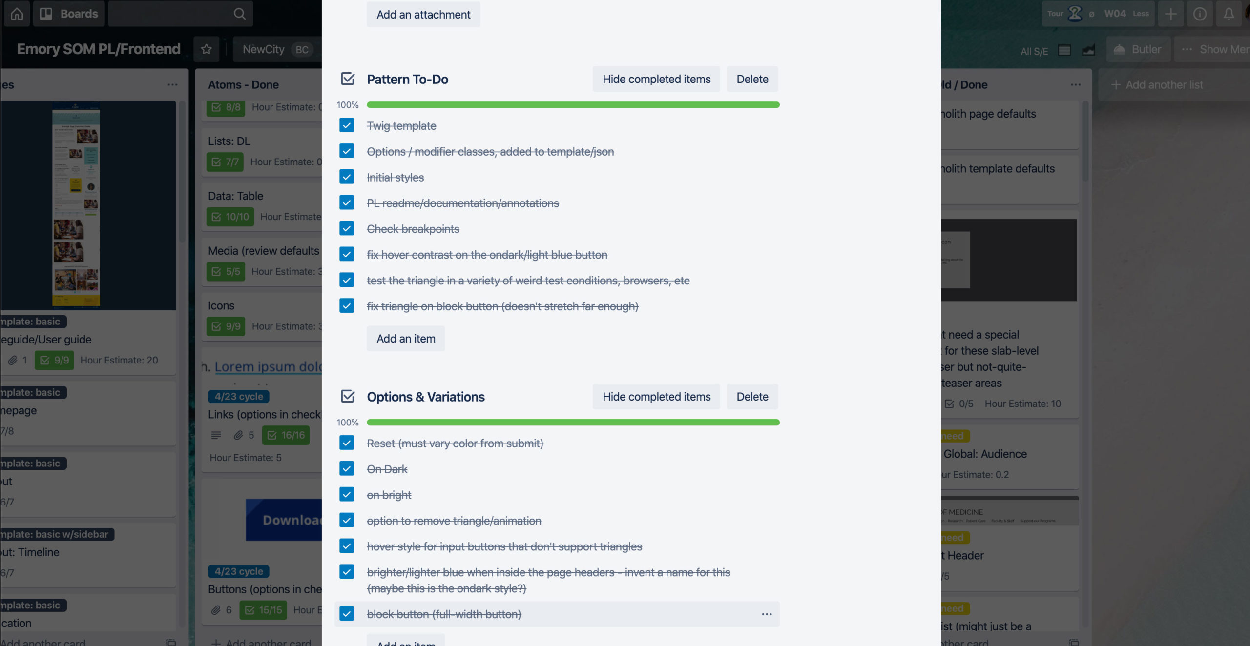
I usually use Trello to organize all the patterns onto a board. As each design is produced, I review the comp and make decisions about what the atoms, molecules, and organisms will be. I also plan the template structure and color-scheming system.
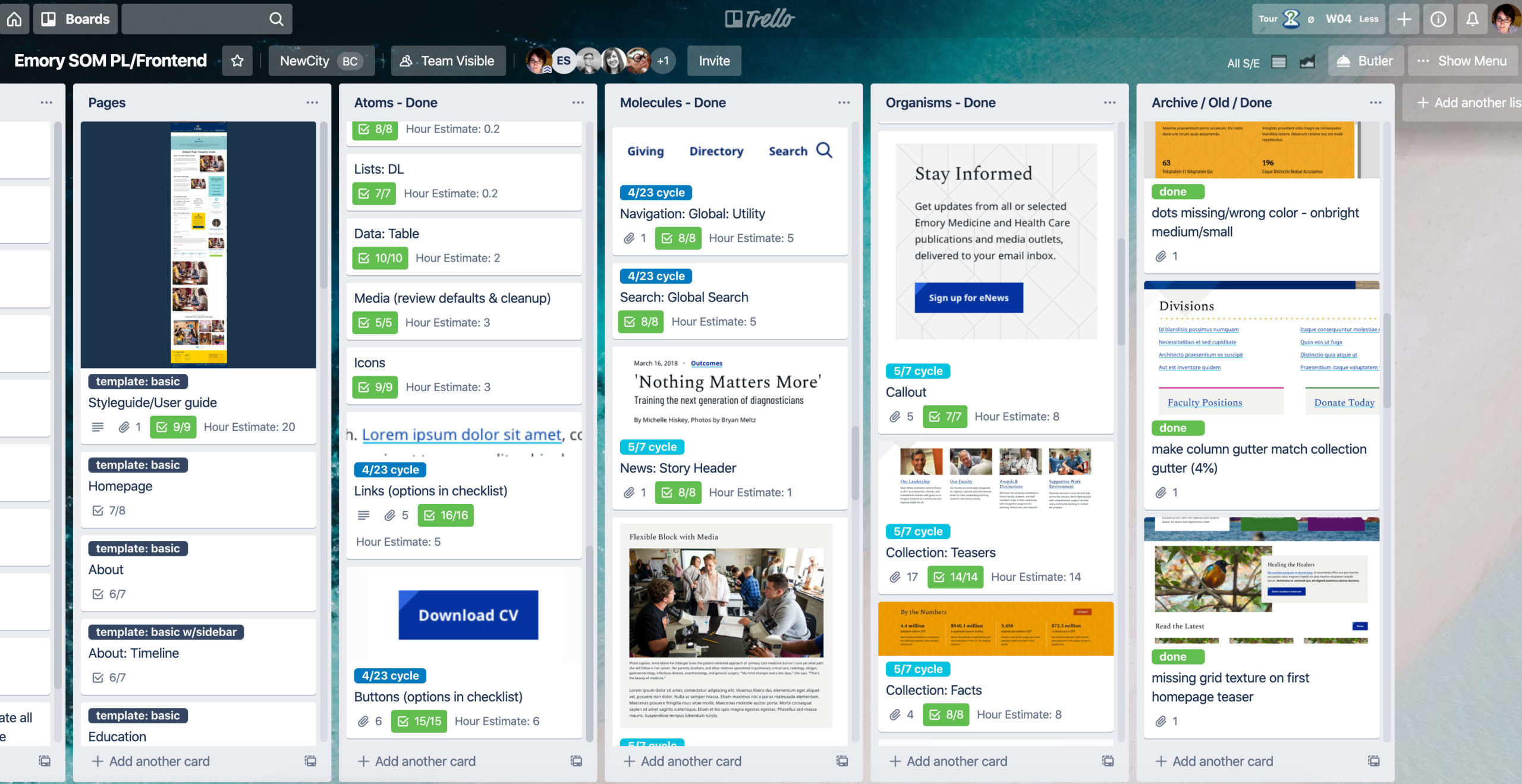
Screenshots from SOM’s pattern kanban Trello board. Click to embiggen.
With the beginnings of a plan in place, I began development in Pattern Lab. During development, any changes to the plan were recorded in the Trello board, making it easier for nondeveloper team members to follow along with what was being built and when. Each pattern documented on the board was coded into a library of modular parts.
Development Strategy
Emory University uses Cascade CMS for all their sites, including SOM. NewCity doesn’t do Cascade development in-house, so we partnered with a third-party agency to integrate the site. When we do CMS integration ourselves, it’s generally a collaborative process — multiple developers working together and contributing to a single repository.
Since I knew we’d be handing off development of SOM — sending my code off into the void — I wanted to ensure the smoothest possible build process for our integration partners.
One of the best ways to achieve that is to simplify and normalize the patterns as much as possible. That means keeping markup minimal and demonstrating all of a pattern’s possible variations (within reason — combinations are exponential).
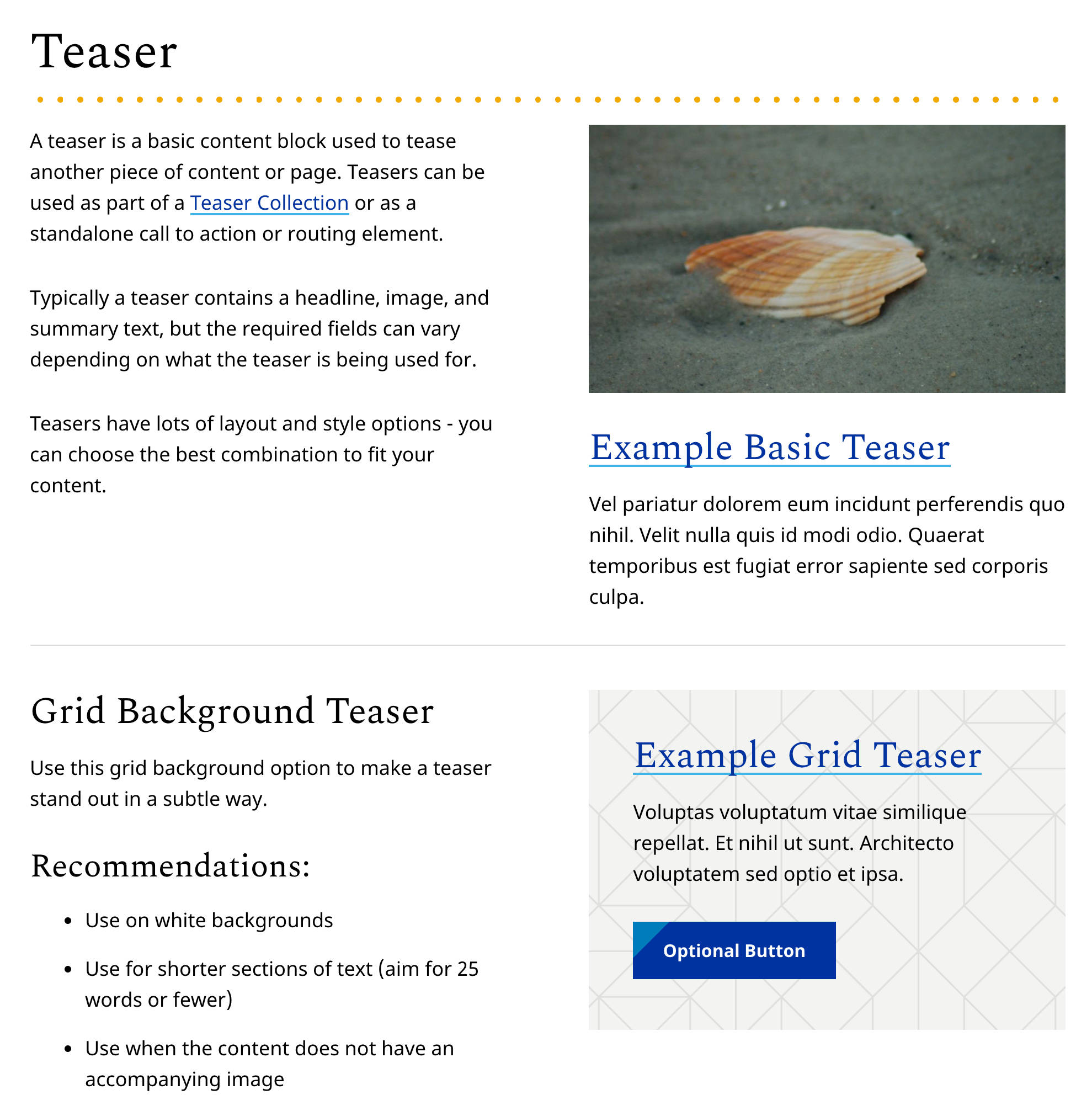
This is a strategy I try to follow in all my libraries, but a good SOM example is the project’s teaser molecule. A more complex version of the flexible blocks I designed for labs and departments, teasers are everywhere in the SOM site.
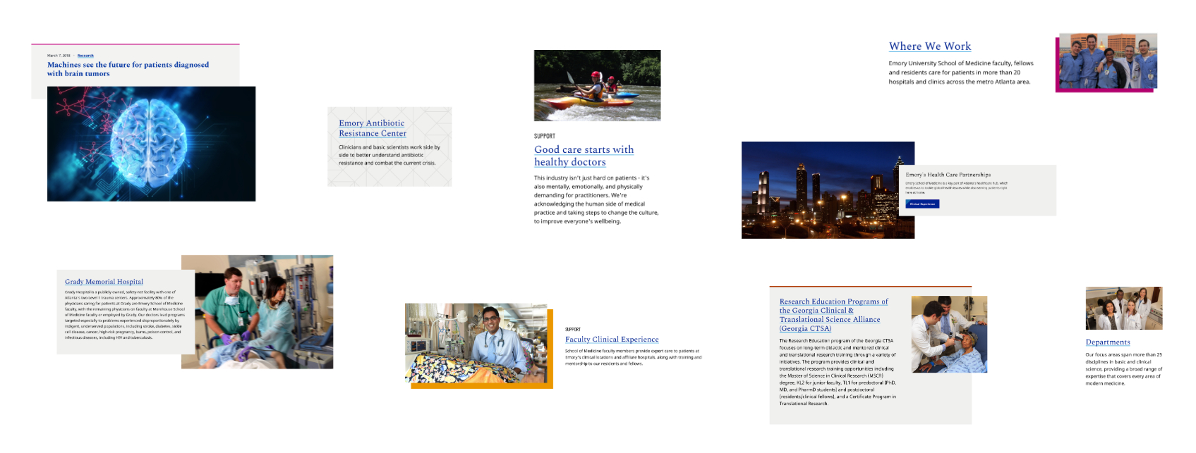
Some of the Emory School of Medicine’s many teaser options. This modular approach provides flexibility for the content editor, while minimizing complexity at the integration stage.
All of these elements are the same base pattern, because they all serve the same purpose: to tease another page’s content. The visual styles vary, and the content can vary, but these teasers are just different ways to do the same thing.
This approach keeps integration simpler for developers, and minifies the broad number of component choices that content contributors have to make.
I discuss a lot of development strategies for pattern libraries in Designing and Coding for Patterns.
Documentation for All
Each pattern in the library is accompanied by a markdown documentation file that describes its purpose, content options, and class variants. This documentation was intended for developers: the third-party integrators, any potential developers on the client team, or anyone at NewCity tasked with future expansion of the project.
That documentation is fine for developers, but SOM’s content managers needed a different kind of reference. Working with NewCity’s content strategist Rachel DeLauder, I built a public-facing style guide that explained what the patterns were and how to use them effectively from a content editor’s perspective.
Pattern Lab made it easy for me to build the style guide directly into the library. This allowed for live examples of the patterns in the guide. Rachel helped me write usage guidelines more oriented toward the site’s contributors than developers.
Armed with the style guide, SOM’s small web team was able to focus more on getting work done, rather than fielding questions from their many contributors.
Examples from Emory School of Medicine Style Guide. Click to enlarge.
How to Improve
When I start a new project, I try to improve on the things in the previous one that didn’t work so well. For the School of Medicine, one thing I would have done differently was how I handled the button hover animation.
On hover, the triangle shape in the top left corner of the button wipes to cover the entire background.

See live examples in the SOM library.
My solution was to make a pseudo element rectangle, rotate it, then scale it on hover. This functions as it should, but it requires a wrapper inside the link/button element. At the time, it seemed like an okay compromise. It’s not though.
Especially in a scenario like this, where integration is completed by another agency, I can’t guarantee the wrapper will always be there. Some third-party tools might not even give the client the option to add a span inside a button. So in those cases, the wipe effect is lost and the user only sees a basic fade to the hover background color.
Pseudo elements don’t even render on the input buttons (input type=”submit”, reset, or button) so the effect is lost there too. Which makes completing forms a lot less fun.
A Better Solution
I rebuilt the effect using a background gradient instead, which works much better. See it in Codepen.